

Why B2B website design works differently from B2C
B2B website design works differently from B2C website design because a B2B website needs to accommodate multiple stakeholders, complex pricing models, longer sales cycles, and an emphasis on education over urgent buying decisions.
A B2C website targets an individual customer. A B2B website targets multiple customers in multiple roles from multiple industries, all of whom serve the interests of a larger business. B2B website design best practices differ from B2C website design best practices.
Start with the buyer, not the brand
The first of our B2B website design best practices is as follows: start with the buyer, not the brand. A good B2B website focuses on the buyer, not the brand they are targeting. Here is how you can start with the buyer and develop an effective B2B website:
- Define the buying committee: B2B purchases generally involve multiple stakeholders, each of which has a different role. Go over the stakeholders you are targeting and create pages that target their needs.
- Understand the workflow: Your B2B website should be based on the tasks, goals, and needs of the buyers you are targeting. This requires thorough research and an in-depth understanding of your product.
- Focus on buyer intent: Build your B2B website’s user journeys around what your buyers want to learn across each step of the process.
Outside of those B2B website best practices, there is something else: build your homepage and/or navigation around the role/industry you are targeting, or a specific use case. This is a core component of B2B website design and, without it, customers may not know what you offer. Here is one example, of a homepage/navigation page of this sort, from Snowflake:
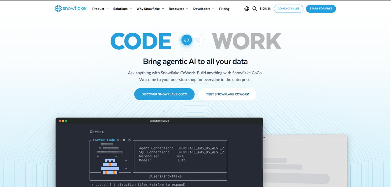
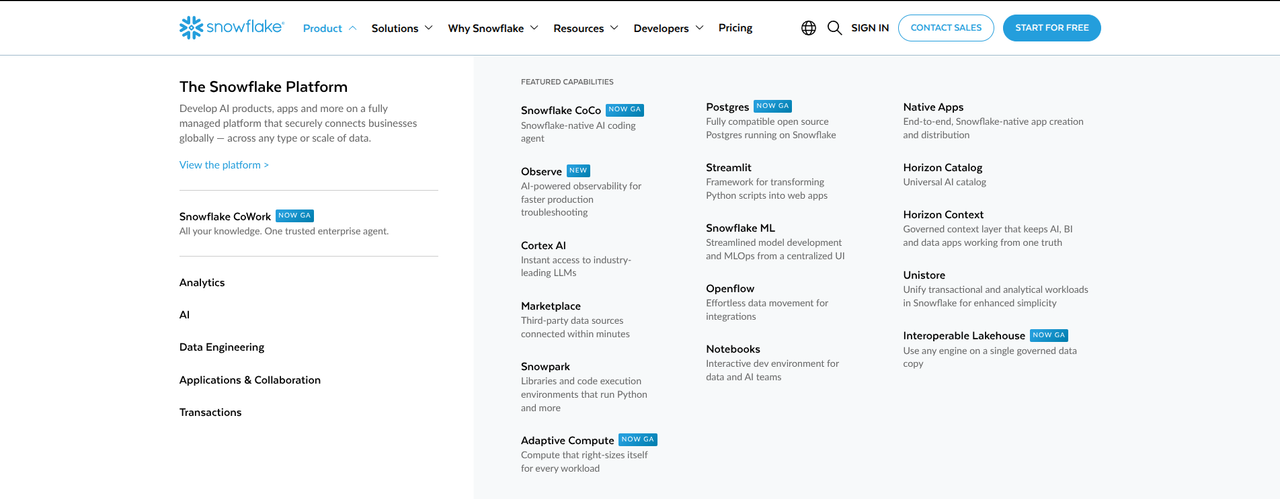
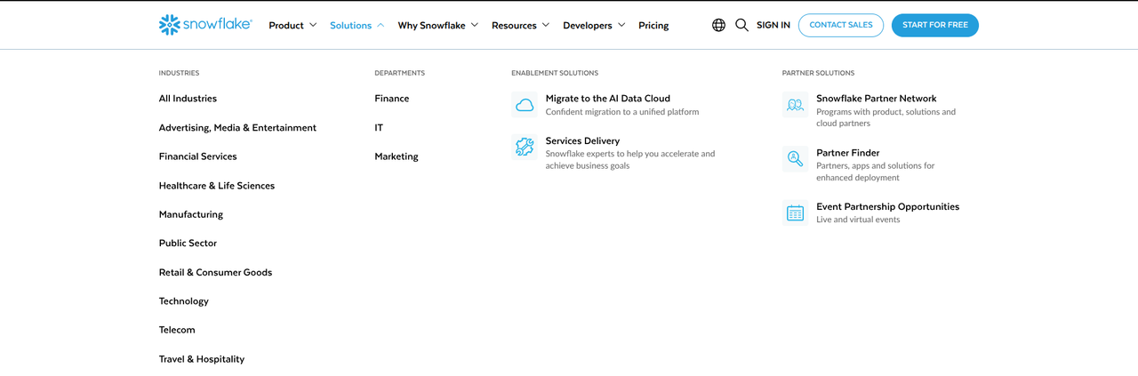
Snowflake’s homepage and navigation design does three things very well:
- Fragmenting the audience: Instead of offering a generic “product features” page, Snowflake offers unique pages for the industries it serves. This demonstrates that Snowflake understands the unique regulations, needs, and limitations inherent to each industry. On top of that, this navigation element makes it easier for customers to see if Snowflake offers a solution to their unique problem.
- Targeting specific departments: Many industries rely on the same basic departments to make purchasing decisions. Snowflake understands this and offers three unique landing pages for three key departments: Finance, IT, and Marketing. All three of these pages demonstrate their understanding of those departments.
- Individual pages for individual features: A particular stakeholder may only be looking for a specific feature. They do not want to wade through a long list of features just to see if a product offers that feature. By creating separate pages for each feature, and putting them in the navigation, customers can see if Snowflake offers what they are looking for.
Lead the homepage with a value proposition, not a tagline
The second practice, for this guide to B2B website design best practices, is to lead the homepage with a value proposition, not a tagline.
Many websites lead with a tagline, but this isn’t what your B2B website should do. Your B2B website’s homepage should lead with a value proposition that highlights the main service you offer.
In the space below, you can find three hero sections that lead with a value proposition.
Our first example, out of three B2B website examples for this section, is OrShot’s homepage:
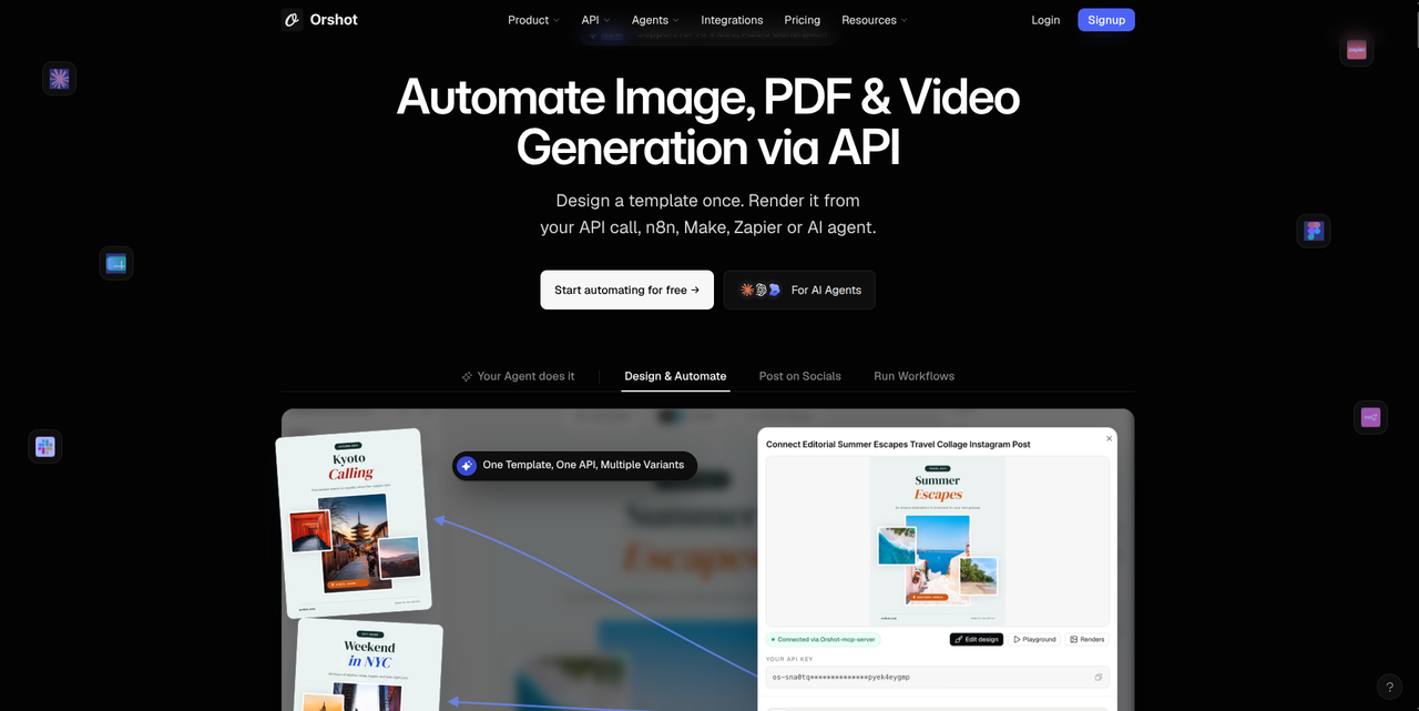
If you look at this homepage, you will see two things:
- The main value proposition is right at the top of the page, in bold lettering: Automate Image, PDF & Video Generation via API.
- This value proposition tells you who the product is for: people that use APIs and/or agents to develop and automate their content.
Our second B2B website design example is from CiaraSight:
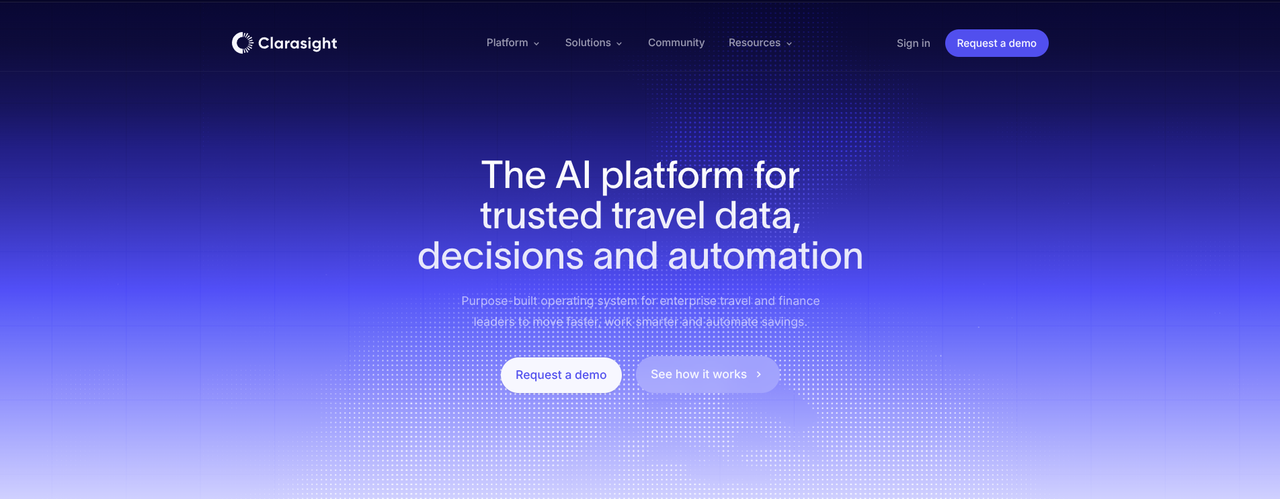
If you look at this homepage, you will see two things:
- The homepage tells you who this product is for: enterprise travel and finance leaders that want to make smarter, faster decisions while saving money.
- The homepage tells you what it does for enterprise travel and finance leaders: automate travel decisions and gather travel data using automated processes.
Our third, and final, example, for this B2B website design examples section, is from WebAnatomy:
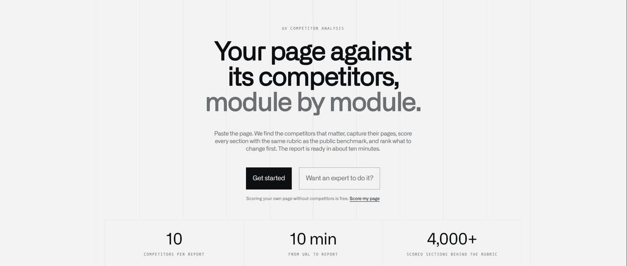
If you look at this homepage, you will see two things:
- You can learn what this product does by reading the homepage: it performs UX competitor analysis by developing reports that compare your page with its competitors.
- The function of this product is also the audience it serves: WebAnatomy is a UX competitor analysis tool and WebAnatomy is for UX designers.
Before we conclude this section, here is a B2B SaaS website homepage design with a vague tagline:

If you look at this homepage, you will see two things:
- The tagline does not say what this product does or who it is meant to serve.
- The description underneath the tagline fails to articulate what this product actually does.
Looking at this homepage tells you very little about the product. This is in contrast to the three prior homepages, all of which tell you what the product does, who it is for, and what makes it useful.
You can learn more about B2B homepage hero design by reading Path To Flow’s “Hero section design for B2B sites: Above the fold clarity (with examples)” guide.
Build the sitemap around the buying journey
Our third B2B website design best practice is to build the sitemap around the buying journey. The strongest B2B websites map their navigation to three core elements: awareness, evaluation, and decision.
Here is how this should work:
- Awareness: Customers want to make sure you understand the limitations they are dealing with. These limitations may be rooted in their industry/role, as well as the regulations imposed by those things. Your B2B website should feature pages that highlight your understanding of these limitations.
- Evaluation: Customers want to know if your product solves the problems they are dealing with and if this product solves that problem within the framework they are navigating. This is what they evaluate. Your B2B website should feature pages that clarify the solutions you offer.
- Decision: Customers want to make sure your product passes the necessary security, legal, and compliance audits and that it comes with a demonstrable ROI. Your B2B website should feature pages that highlight the security, legal, and compliance regulations you abide by, as well as metrics that clarify your ROI.
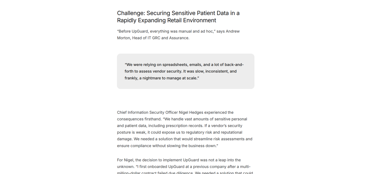
To understand these B2B website design elements, you can look at UpGuard. UpGuard features a navigation system that is mapped to those three core elements. Here is their homepage and top-level navigation menu:
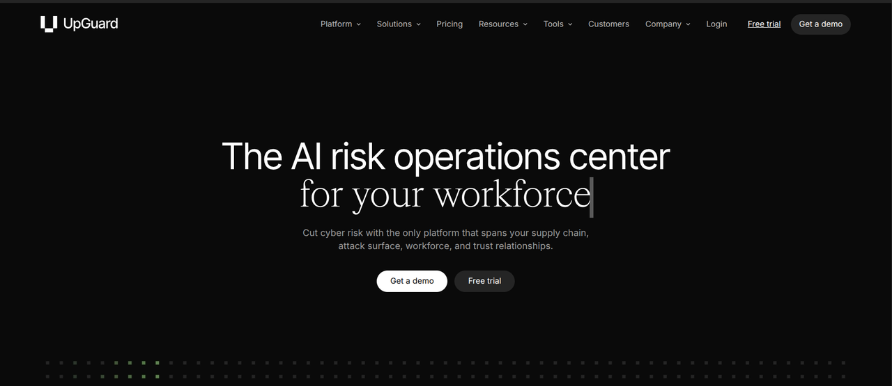
If you go to the “Solutions” button, you can open this menu:
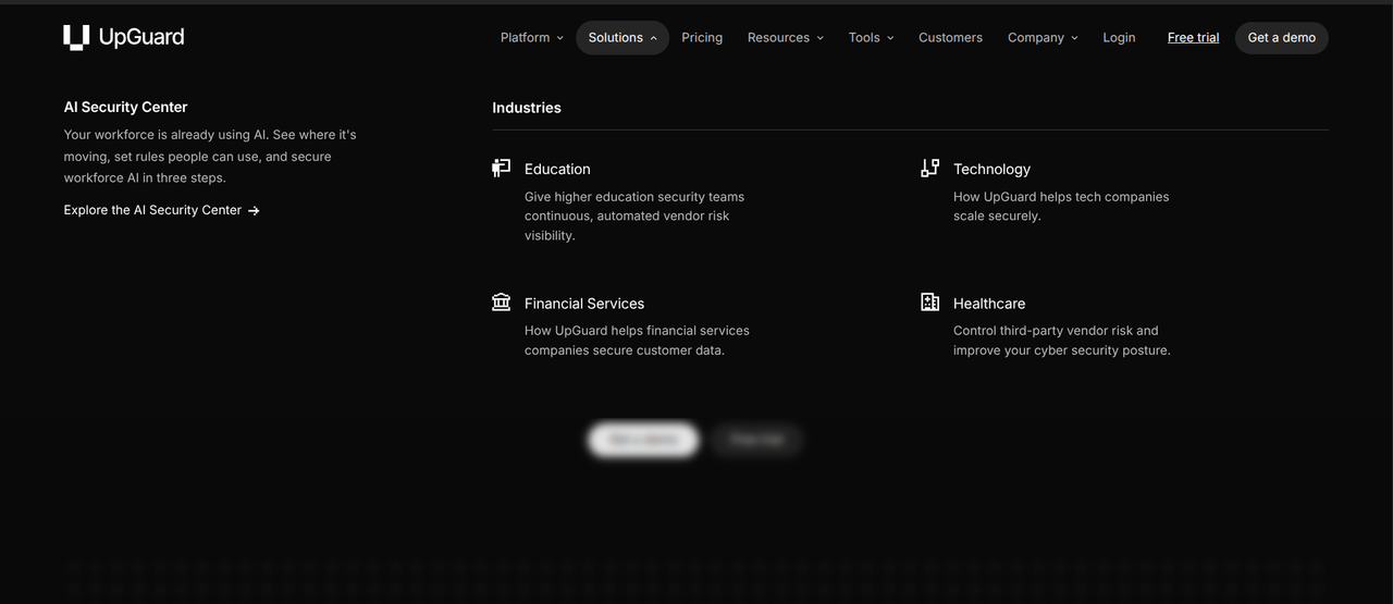
Clicking on the “Education” button leads to a page tailored towards those in the educational field. This page includes an overview of how UpGuard’s product helps those in education and a wealth of further resources that highlight UpGuard’s expertise.
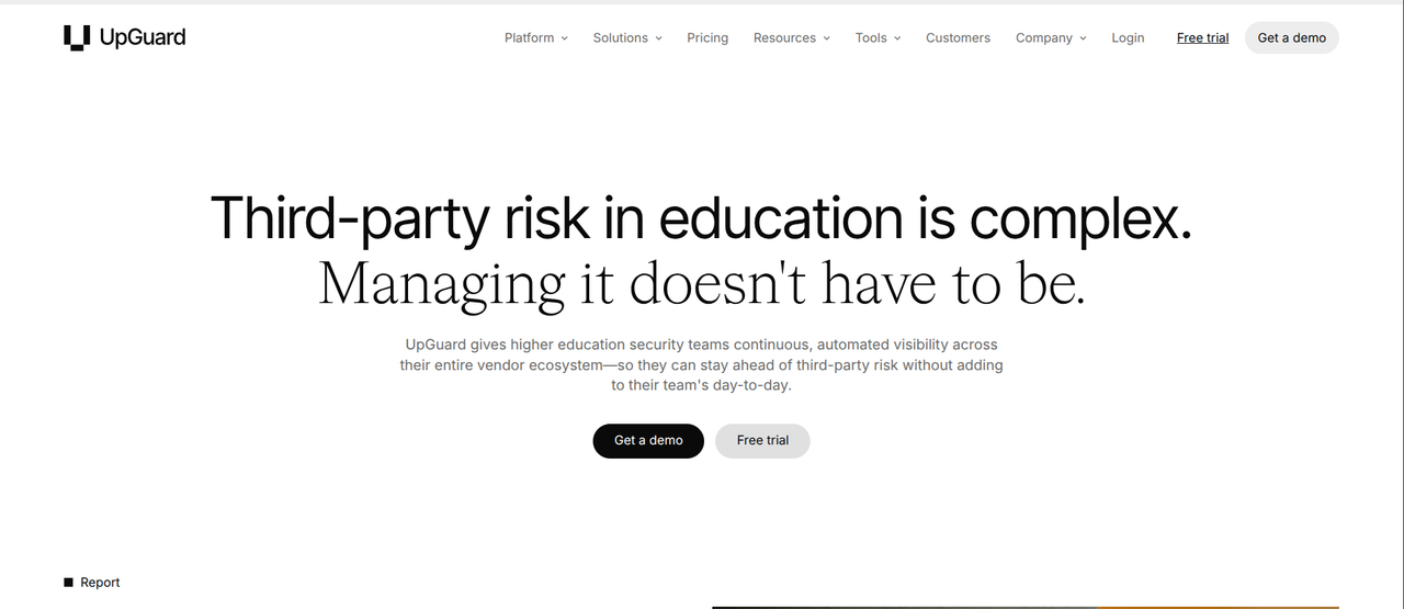
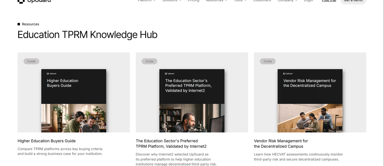
All of this aids in “Awareness.”
For “Evaluation,” every single “Solutions” page goes over how UpGuard’s product solves the problems associated with a particular industry. Here is one example from the “Education” page:
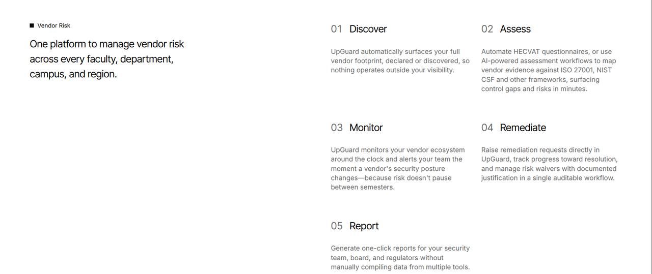
The third element is “Decision.” UpGuard engages with this element in a few different ways, one of which can be seen below:
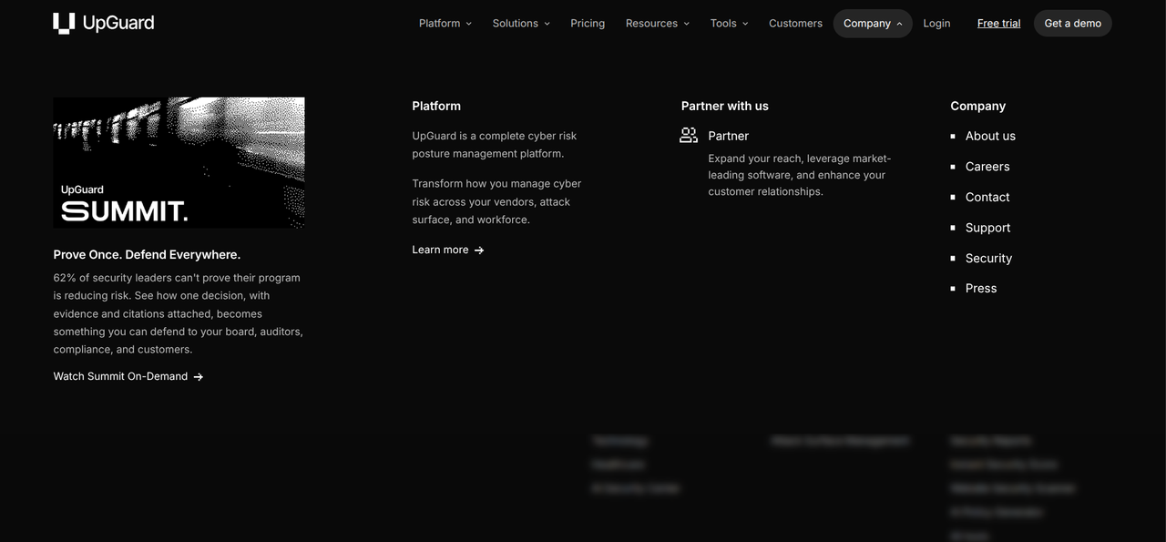
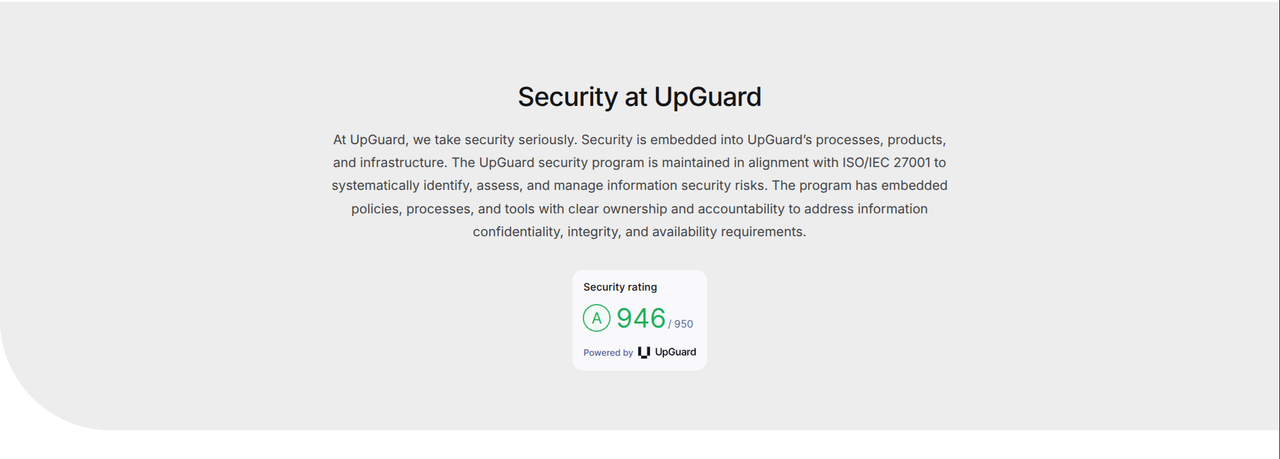
Clicking on “Company” will lead to a menu and, within this menu, there is a “Security” button. Using this button brings you to a menu that goes over UpGuard’s numerous security features.
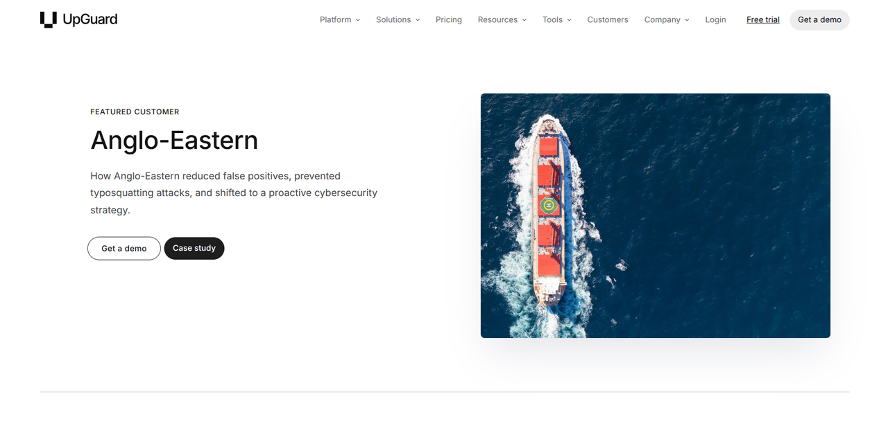
If you return to the top-level navigation menu, you will see a “Customers” button. Clicking this button takes you to a menu with case studies from some of UpGuard’s biggest case studies.
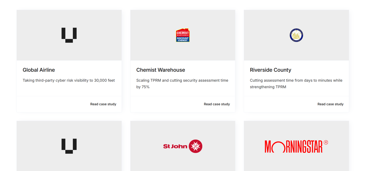
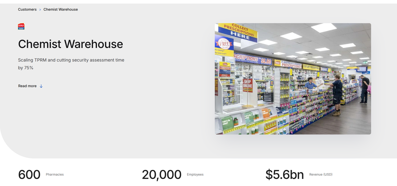
You can read those case studies to understand how UpGuard serves its clients and the overall ROI they provide each of those clients. Many of these case studies also highlight the ways in which their products pass the necessary audits.
Make proof visible before the ask
The fourth B2B design best practice is to make proof visible before the ask. This is because a high-converting B2B website needs social proof: logos, case studies, metrics, and testimonials. Each one of these social proof mediums demonstrates the value of your product. This proof should be visible before customers are asked to purchase your product, contact you, and/or book a demo.
Here is one key point for each one of those social proof mediums:
- Logos: You can use the logos of businesses that use your product. Placing these logos on your website tells customers that other businesses have found your product valuable.
- Case studies: You can develop case studies for businesses that use your product. These case studies can go over how you solved their problem and highlight the ways your product can solve other businesses’ problems.
- Metrics: You can craft metrics that demonstrate the ROI of your product. These metrics should be tied to your product’s core features and the industries/roles your product is meant to serve. Customers can look at these metrics to understand the ROI your product will create for them.
- Testimonials: You can ask the businesses that have used your product for testimonials. Putting these testimonials on your website tells customers that other people have found success with your product.
You should place social proof in spaces that are adjacent to, or immediately before, every major call-to-action:
- Above the fold: You can place a notable metric or recognizable logo in your hero section. This metric/logo can be beside or below a call-to-action, such as “Start a Free Trial” or “Book Your Demo.”
- Pricing pages: You can place testimonials within each of your pricing pages. These testimonials should feature an outcome, such as “We cut costs by 30%.” They should be placed right next to a tier selection menu or a purchase-focused call-to-action.
- Contact forms: You can place compliance logos and security badges right by your contact forms. These logos and badges serve as proof that your product complies with the necessary security/legal restrictions. They help customers trust you, making it easier for them to move forward.
- Products and features: You can place brief testimonials, links to case studies, and metrics in the pages that feature your products and features. These help customers understand the value of those products/features.
The above are just a few examples of what is possible.
Here is one example, from Humblytics, of social proof placed within the hero section:
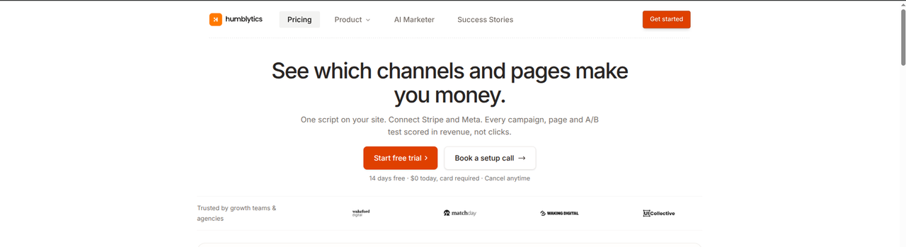
Right underneath this hero section’s CTAs, you can see four logos. Each one of these logos is a business that uses Humblytics’ product.
Here is one example, from Spellbook, of case study links placed within a product page:

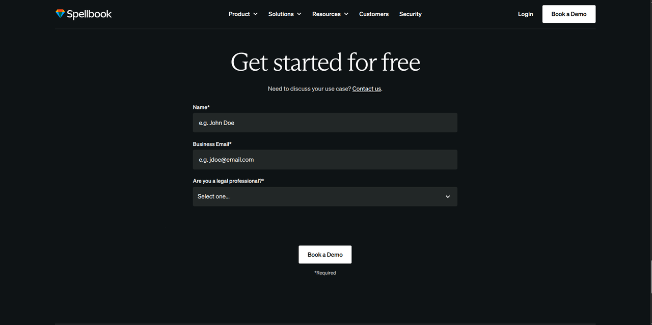
Right below those case study links, there is a CTA. Being able to see how Spellbook has helped other industry leaders makes it easier for customers to move forward with their own booking.
Here is a final example, from Routable, of testimonials placed right underneath the tier selection table:
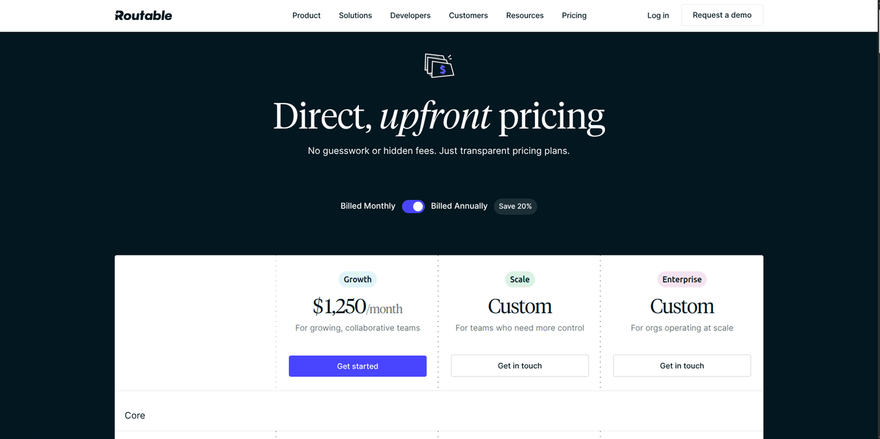
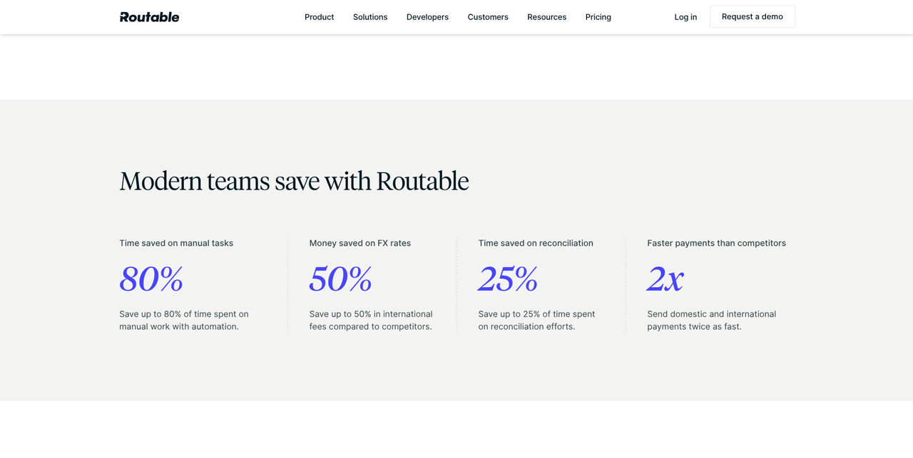
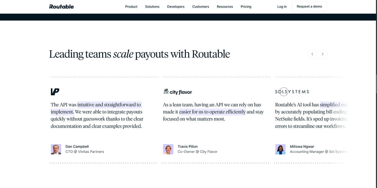
Customers interested in Routable can scroll through their pricing tiers. Reaching the end of these tiers will reveal testimonials and key metrics, both of which can convince customers to move forward with a purchasing decision.
Design for the decision, not the scroll
For the fifth B2B design best practice, we have “Design for the decision, not the scroll.” Your B2B website should facilitate the purchasing process. And, to facilitate the purchasing process, your B2B website must be designed around this process, using the following elements:
- Multiple conversion points: You should give customers numerous opportunities to purchase your product. These opportunities should be paired with social proof and, for buyers that aren’t quite ready to commit, secondary alternatives. Secondary alternatives may include case studies or product tours, among others.
- Specific CTA copy: You need to rely on specific CTA copy that varies depending on its placement. A good piece of CTA copy can be “Click here to request pricing” or “Book a 30 minute demo.” Every piece of CTA copy should tell buyers exactly what it gives them, while making it easy for them to move forward.
- Demo/contact forms: You should create demo/contact forms that avoid over-asking. Typically, this means asking for a name and a work email. If prospects move forward with the purchasing process, you can ask for more specific information, such as their phone number, budget, and tech stack; among other things.
Before we conclude this section, here is a good demo form from Harmonic:
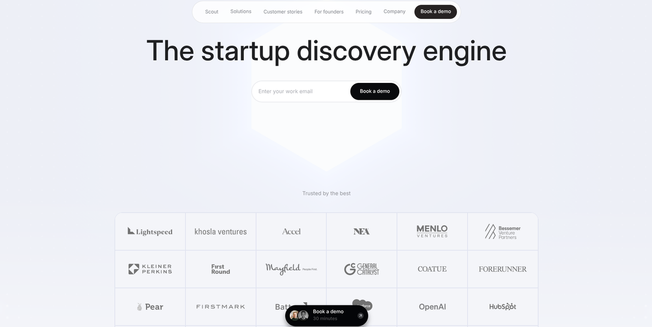
All you need to input is your work email. This makes the decision easy. Plus, there is social proof right underneath the demo form.
Keep performance and SEO in the build, not the backlog
Our sixth best practice, for this B2B website design best practices guide, is to keep performance and SEO in the build, not the backlog.
Speed, mobile usage, metadata, and structure are decided during the build. All of these elements affect your website’s visibility, performance, and accessibility. They cannot be a part of your backlog.
Here are best practices for each one of those elements:
- Do your best to limit bloated tracking tags, autoplay videos, and heavy scripts; each one of these things can ruin mobile load times and hinder conversion rates.
- Optimize your website for mobile devices by making sure your website’s buttons, elements, and navigation menus are big enough for mobile devices.
- Try to keep your title tags under 55 characters and try to keep your meta descriptions under 155 characters. For your title tags, put the primary tag near the front.
- Use no more than one “<h1>” in each page, followed by sequential “<h2>,” “<h3>,” and “<h4>” headings for the subtopics within that page. On top of that, rely on short, descriptive, and keyword-rich URLs.
Here are Webflow notes for each one of the above:
- Webflow automatically converts images into “WebP” files. This reduces their size by around 30%, which can keep your website speedy. Webflow also generates responsive image variants for different screen sizes, which also keeps your website speedy.
- You can optimize your B2B website’s mobile design by using Webflow’s “tablet” and “mobile” breakpoints. You need to set up these breakpoints manually, instead of relying purely on the “desktop” breakpoint, which is the base.
- Every dynamic page within the Webflow CMS offers CMS-driven metadata. You can map the title tag and meta description to specific CMS fields. Doing so ensures that every new page, within that collection, will automatically generate high-quality SEO metadata. Static pages have their own native SEO fields.
- Webflow lets you assign HTML tags to the visual layout blocks that make up a page. For example, you can assign the “<h1>” heading to a specific visual layout block within a blog post page. Using this feature ensures that every page has a clean, tidy structure that web crawlers can navigate.
What the 9 sites have in common
The best B2B websites have these three things in common:
- Clear messaging: The best B2B websites feature clear messaging that focuses on the outcomes their product will deliver, as opposed to just rattling off a list of disparate features.
- Social proof: The best B2B websites feature social proof on just about every page; this social proof highlights the value they offer customers and makes it easier for customers to make a purchasing decision.
- Customer-focused navigation: The best B2B websites feature customer-focused navigation rooted in how customers navigate their website, as opposed to how their business organizes itself.
Your B2B website should make use of these patterns. But, you don’t have to do it alone: click here to visit our agency directory. We can help you find a team that builds this way.

