

What a hero section is (and what it is not)
A hero section is the prominent, visually compelling space at the top of a webpage that introduces the site's core value proposition and its primary call-to-action.
That is what a hero section is and, by extension, what hero section design is supposed to deliver. Here is what a hero section is not: a generic header, a cluttered network of links and text, or a simple banner.
Every hero section looks a little different because every website has its own design goals. That said, most hero sections take up about 80% of the browser's viewport height, which is the recommended size.
A hero section is a single component located at the top of a webpage. A landing page, by contrast, is a standalone webpage optimized for a specific marketing or conversion goal. Together, these two definitions answer the question "what is a hero section?"
What belongs above the fold on a B2B site
Your above-the-fold hero section should tell B2B buyers what you do, the customers you serve, and how your product solves those customers' problems. That leads to the four essentials of any above-the-fold B2B hero section:
- Headline: explicitly states the core outcome your product delivers and the software category it belongs to.
- Subhead: translates your product's main feature into a specific outcome or process that aligns with what your customers are looking for.
- Primary call-to-action: uses high visual contrast to guide B2B buyers to a clear, actionable choice, such as "Book a demo" or "See a demo."
- Visual: shows the product or proof, using a high-fidelity dashboard or UI mockup, or a data visualization that shows the ROI of your product.
Below is a hero section that has all four, followed by our annotations.
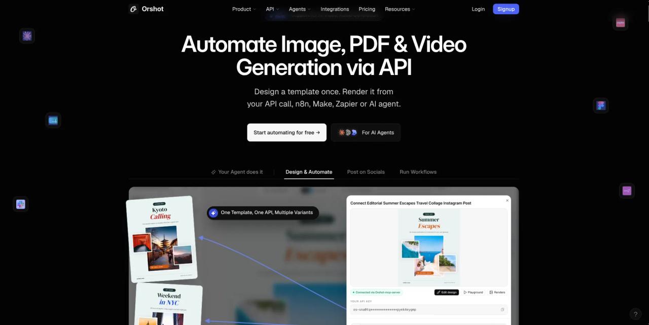
The hero section above is from Orshot. Look closely and you will notice:
- A clear headline that states what the product does and the category it belongs to. In this case, it automates image, PDF, and video generation through an API.
- A subheading that explains how it works in simple, clear language: you design the template once and render it from an API call, an automation tool, or an AI agent.
- A primary call-to-action, "Start automating for free," which takes you straight into Orshot's product.
- A visual that shows the product in action, placed right below the headline and call-to-action, with tabs you can click to better understand the product.
What should move below the fold
Look at enough B2B heroes and you'll find many hero sections contain elements that don't fit. The most common ones:
- Feature lists: many B2B heroes include long lists of product features. These lists are useful, but they do not belong in the hero section.
- Secondary CTAs: many B2B heroes feature more than one CTA, such as "Watch a video demo." Like long feature lists, the hero isn't the right place for them.
- Video autoplay: autoplaying videos take up valuable space, slow down the page, and pull attention from the hero's main message.
- Long logo walls: customer logos are worth having on the page, but a long wall distracts from the information B2B buyers are looking for in the hero.
- Rotating carousels: carousels force buyers to wait for slides to reveal the information they need, and many will leave before they see it.
All of these can be part of your website. They just should not be part of your hero section. Here is where each one belongs instead:
- Feature lists: place them right below a social proof section, with both sitting further down the page from the hero.
- Secondary CTAs: if you need one, move it out of the hero or reduce it to a plain text link.
- Video autoplay: give video its own dedicated section further down the page.
- Long logo walls: place your five most notable logos directly below the hero to reinforce the value you deliver.
- Rotating carousels: pick your strongest value proposition for the hero and turn the other slides into scrollable sections below it.
Here is one example of an overloaded hero section that features several of the elements listed above:
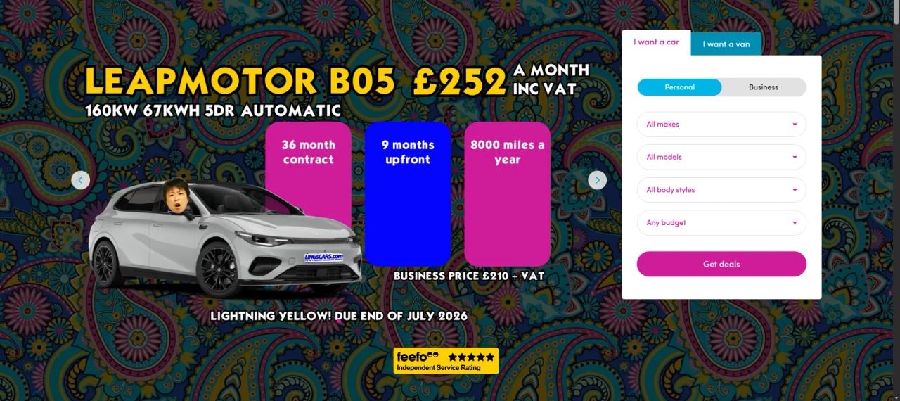
This hero section uses a rotating carousel, and each slide carries its own brief list of features.
On top of that, it stacks several menus into the hero, each ending in a call-to-action you only reach after entering several pieces of information.
This hero is doing far too much at once. The sheer amount of information it gives you, and asks of you through its CTAs, makes it hard to navigate and can overwhelm buyers.
Modern hero section design requires simplicity, clarity, and specificity. Those qualities make it easier for buyers to understand what you offer and move forward with a purchasing decision.
Hero rewrite 1: the vague headline
Our first hero rewrite comes from incident.io. Here is the headline from its hero section:
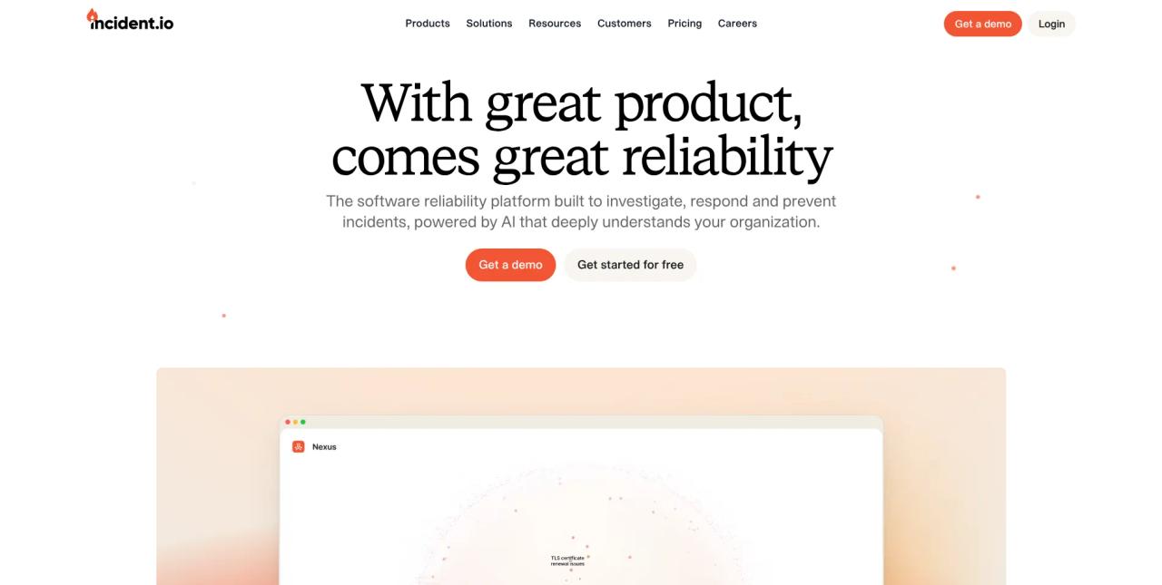
"With great product, comes great reliability." This headline is vague. It doesn't tell you what the product does, and it never names the category the product belongs to.
Here is an alternative headline from a competitor:

This headline tells you what the software does and what type of software it is. It is admittedly less “clever,” but it is certainly more clear. The Incident.io example works great for people who already know what it is. Better Stack speaks the language of its end user/buyer.
Hero rewrite 2: the feature dump
Our second hero rewrite comes from AppFolio. Here is AppFolio's hero section:
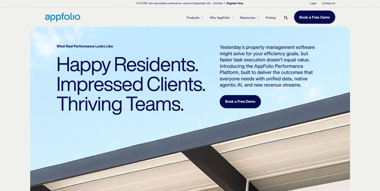
Look at the paragraph just above "Book a Free Demo" and you will see two things. The platform says it is "built to deliver the outcomes that everyone needs," then lists the features it uses to do that. The problem: it never says what those outcomes are or how those features connect to them.
Here is an alternative version of that section from a competitor:
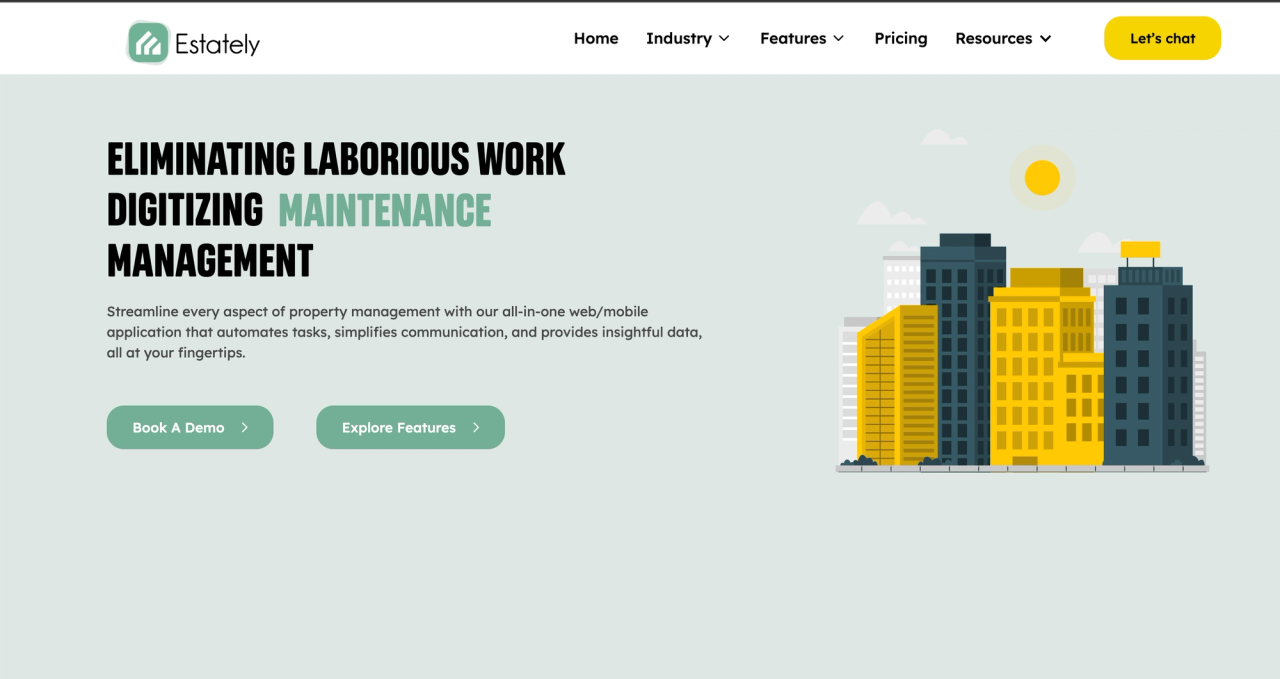
A hero subheadline should name the primary feature your product offers and the primary outcome that feature creates. It should not be a list of features, and it should not be vague.
Hero rewrite 3: two competing CTAs
Our third hero rewrite comes from Plaid. Here is Plaid's hero section:

This hero section has two CTAs. Plenty of heroes do, and while it can be useful, it often leaves potential buyers unsure which one to choose.
Here is a slightly modified version of Plaid's hero section:

The new version has just one CTA, which makes it easy for buyers to engage and move forward.
Choose the CTA most likely to lead to conversions. "Contact our team" might work. But if buyers in your market like to see the product before reaching out, a CTA like "See a demo" or "Try it today" may perform better. It depends on your product and your customer.
Multiple CTAs are a very popular choice for headers, but I think it’s important to consider cognitive load. A decision to make… already? Consider aligning on the most desirable next step, and focus on that.
Mobile hero decisions
A few elements of your hero section change drastically on mobile devices:
- Headline length: headlines wrap onto more lines in a narrow viewport, so long headlines push everything else down.
- Visual cropping: your visuals will look different on mobile and may be cropped.
- CTA position: your CTA will likely shift position, which can make it less intuitive to find.
On desktop, these elements look the way you designed them. On mobile, they can look very different. Here is an example from Habitat's desktop hero section:
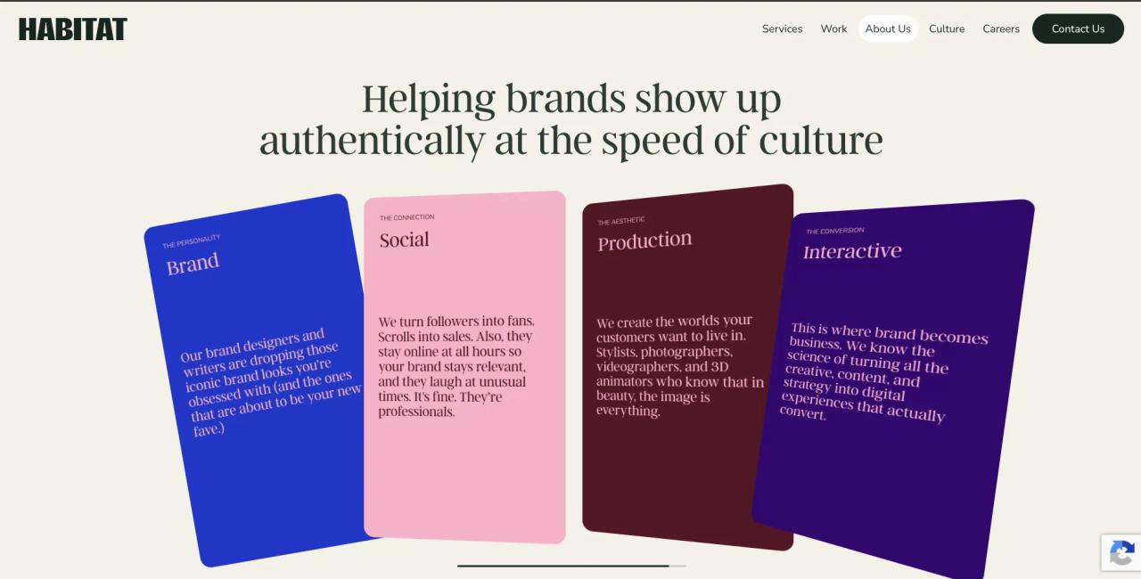
And here is the same hero section on a mobile phone:
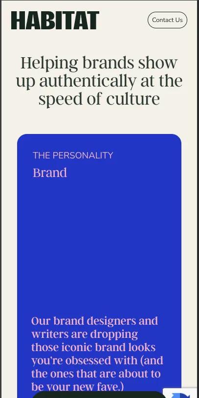
Beyond those three elements, there is page weight to consider. Large hero visuals load more slowly on mobile devices. Ask whether each visual provides clear context or value on a small screen. If it doesn't, hide it on mobile or swap in a lightweight alternative.
A Webflow note on breakpoints: styles set on the desktop (base) breakpoint cascade down to tablet and both mobile breakpoints, so a change on desktop affects every screen size. Styles set on a smaller breakpoint only cascade down from that point. A change on tablet affects tablet and mobile, while a change on mobile portrait affects only that view. Make mobile-specific hero adjustments on the mobile breakpoints so your desktop layout stays intact.
Building and testing heroes in Webflow
Building and testing heroes in Webflow can be a little tricky, especially if you have never built a hero section before. These build notes make it easier:
- Components: build a master hero component with props or slots for the headline, subheadline, primary CTA, optional secondary text link, and any background media.
- Variants: duplicate the headline text block inside the component and keep the wrapper size fixed so the layout doesn't shift when the text changes. This lets you test copy variants in the same layout.
- Headline testing: assign a unique ID to each headline variant so A/B testing tools can target the text and swap it cleanly.
Once your hero is live, keep an eye on three metrics:
- Click-through rate: how many visitors click your primary call-to-action.
- Scroll depth: whether visitors scroll past the hero into the deeper sections of the page.
- Bounce rate: how many visitors leave without scrolling or clicking anything in the hero.

